
Original author: Michael Phillips
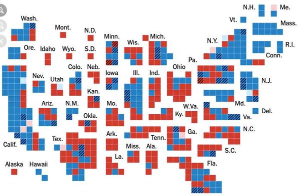
Look at these two photos.
Photo 1 is what we usually see. It leads lots of people to come to the conclusion that most of the U.S. is conservative. And to make lots of assumptions about how those blue areas are somehow stealing elections from all that red.
Photo 2 is a cartogram of the same information, with each square representing both an individual district and an approximately equal population. It gives a MUCH more accurate reading of the state of things.
The point is: land mass doesn’t vote. People do. And whether they live in sparsely populated rural areas or in densely populated urban areas, each vote is worth exactly the same – no more and no less – as any other vote.
Photos from the New York Times election coverage.
Original page citations for the maps can be found at: https://www.nytimes.com/…/results-house-elections.html
